
If you’ve been following this blog for a while (specifically a year), you may remember when I set a goal for myself to submit my game to Indiecade. Well, you see, though I may have implied that I was aiming for Indiecade 2013, I was actually planning on submitting to Indiecade 2014 the entire time! That is to say, in roughly the next week I’ll be submitting my game to Indiecade, right on time, just as planned.
Hmm. Yes. That’s what we’re going with.
It’s pretty exciting to send the game off for the first time to a real critical “audience” (if only of one or several people) – and it’s exciting that I feel the game is at a point where it’s really presentable and can speak for itself. Though aesthetics may or may not be critical for game competitions of this sort, I definitely took a lot of time recently implementing changes to the game’s visuals that I had been aching to for a while.
Let’s take a look, shall we? (NOTE: Below are some GIFs which wordpress resizes, and it kinda messes with the image. To see them in their proper resolution, simply click on them.)
1. Shadows!
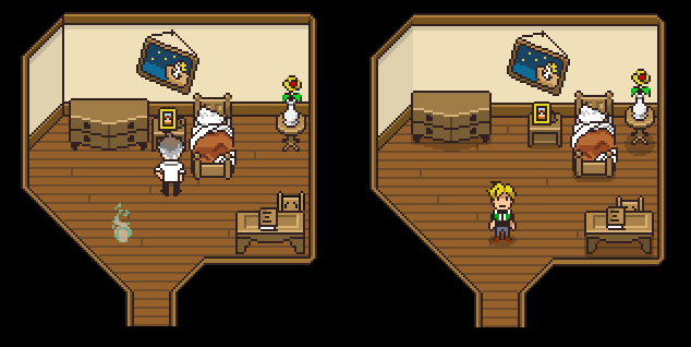
Once upon a time, Why Am I Dead At Sea had no shadows. It existed in a world with purely ambient lighting; light was everywhere. It came from nothing and went nowhere, and therefore, no shadows! Someone pointed out to me that shadows were a relatively easy change that could make everything seem more grounded. It was obviously good advice, but at the time I wasn’t willing to go through every prop when I had a million other objectives, so I took a half-measure and added shadows to all of the characters.
Well now, all people and objects have shadows! And as expected, it didn’t take a huge amount of work, and definitely makes the game look better. Everything is less floaty and it’s much clearer where they’re positioned on the ground. It also just kind of breaks up the flat colors of the floors and adds some much needed detail.
2. Additional Backgrounds
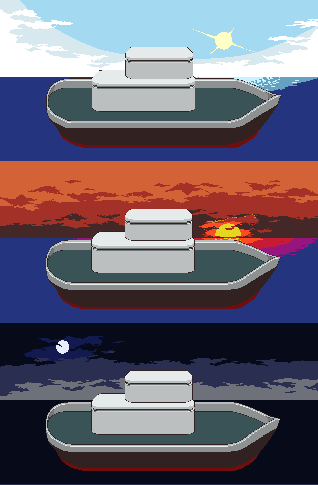
As the content for the game continued to be made, there were points in the story where it is made clear that time is progressing, either from one day to the other or from morning to night – and yet when you go onto the ship’s outside deck, it was always the same time of day – sunset! That’s obviously because it was the only background I had made at that point. For some points in the game, though, it seemed really important that I get the alternate backgrounds which show different times up and running.
They help set the mood for the story in a big way, so once I got to a certain point it became a really high priority. But, that’s not all I did with regard to the outside-the-ship area!
3. Parallax Scrolling
If you’re not familiar with parallax scrolling, well, parallax is the effect of objects farther away not moving as much to us, thereby creating our perception of depth. Parallax scrolling is the simulation of parallax in media whereby different objects scroll at different speeds to signify depth.
After creating my lovely backgrounds for the outer deck, I brutally chopped them up and put them in separate images. I then created a special kind of Prop (ParallaxProp) that contains a set of images and has them scroll along with the game camera at different speeds. It was actually really simple to implement on the code-side; it probably took more time overall just cutting up the backgrounds and making sure the end visual result was what I was looking for.
Because the area is so relatively wide, if the scrolling is too extreme things don’t really match up or work out how I want them to. So, the scrolling difference is intentionally small, creating a subtle but still noticeable effect.
This was one of those features where it was “really cool if I could implement this, but I don’t know…” So, it feels really nice that I actually did end up getting it done! And it really didn’t take me a huge amount of time.
3. Water Animation
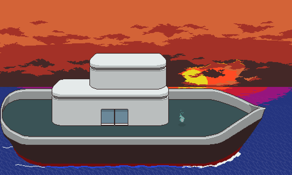
I always knew that the boat’s lower outline and the ocean were going to need some kind of…change. A pure and unchanging blue rectangle didn’t quite cut it. What I have now is still imperfect in several ways, but at least communicates what is actually happening and isn’t as blindingly static.
Figuring out how I wanted to do this and implementing it were surprisingly tricky. For one thing, the water was originally a part of the map itself and I’d never made an animated object as large as this before, so there were a lot of possible ways I could implement the small waves in the water. I could animate them tile by tile, in which case it might make more sense to make it an extension of the map itself, or I could make one huge animated object, in which case I would probably make it a prop. The latter would most likely put much less strain on processing time, but would result in a really unwieldy and humongous bitmap. I ended up taking the middle-ground and made some 7-8 animated props, each of which was a small but wide “strip” of the full thing. The image files are small and simple, and there still isn’t a lot of labor that the game has to do to animate them.
I also had to decide how I could get animated water to agree with depth, since the part of the background above the horizon has objects (ie the sun and moon) that are far in the distance, while the animated water is completely flat. Most ways of trying to actually get the water animation to obey depth seemed either ugly or way too hard, so I compromised again and simply had the opacity of the waves fade as they get closer to the horizon. This was only possible because of the approach I took in cutting up the animation into small little strips, so it’s nice how the two issues fit together!
Actually this is not all of the visual changes I made, but they’re probably the most apparent ones, and they’re the ones I’m proudest of. None of the changes I have made are huge, as I’m not looking to give the game a full make-over, of course…but they add up to a much prettier game nonetheless. While there are still some things I really want to fix or renovate, the game is actually really close to how I expect it will look as a final product.
Now then…fingers crossed on the whole Indie-Cade business!
