Menus and Screenshots for WAID2

Happy Fourth of July for any state-side readers!

Progress on Why Am I Dead II could be fairly characterized as slow but steady.  After giving up the ghost (ha) on the Indiecade deadline, I have to find something else to latch onto so that I can push myself harder.

But that’s not to say that I’ve slacked off!  I decided to take a break from art and return to programming.  Much like how pulling a thread can unravel an entire garment, a small change to how I displayed things on screen turned into a pretty thorough upheaval of the whole game engine.  It was a long time coming, since a lot of the original code was 1) written a year ago and 2) written with a much smaller project in mind.

The benefit of all that work is invisible, but present.  The code is just overall a lot better and less stupid.  It’s still pretty stupid in some places, but a lot less so.  And that’s always good.

I then returned to the initial reason I made the change that started all of that, which was menus!  I wanted overlapping flexible menus, and now I have them.  This will be used for the starting menu and the pause menu, and will be responsible for loading your game and changing your game options.

A rough version of the screen housing your Save files.

The biggest challenge for this was mostly getting the controls to work for both the mouse and keyboard smoothly and intuitively.

I was then able to return to working on the game art feeling a bit refreshed.  I’ve now expanded the scenery assets to a point where I’d rather not even list them, as it’d take up too much space!  I’ve also filled in the majority of the game maps, to the point where the end is in sight.  You can probably infer this, but there is a lot more space, and a lot more scenery, and a lot more everything in this game than the last.  A big reason this is taking longer than I estimated is what I guess could be called art creep, wherein I compulsively add this or that art asset on the fly to fill things in more.

So, for the first time, I’d like to share completed mockups of the game in action.  But as tradition goes, let’s start by revisiting screenshots of the original game:

And now the new — keeping in mind of course that this is a tiny fraction of the completed environment/scenery from the game!

The Pixels Never End

As usual, the work on WAID continues.  Just to get this out of the way, I’m finally pronouncing dead my goal of submitting late to Indiecade.   As much as it pains me to sit on my work as time goes by, I still just don’t feel comfortable sending out what I have.  Mainly, I wasn’t able to get as far in development as I was hoping.  I guess it didn’t help that I now know I won’t be in the country when Indiecade is going on, so any benefits that submitting a game confers for conference attenders are void.  And considering the scale of the game and my development schedule, by the time I actually get feedback from the jury I’ll probably be in the final stages of development, if not finished.  But I’m glad I at least set that goal, as it definitely helped push me along and sped things up!

I’ve got the characters and the tilesets — now I just have to fill out all the scenery/props for the game.  After animating all of the characters, I can’t adequately express how pleasing it is to create a sprite and be able to just move on, without having to create 25+ slightly different copies of it.  If it looks good, that’s it.   Next one.

It’s also a bit nice to return to some objects that I had done for the first game and put a slightly different spin on it.  With the simplistic style I’m using, it can only improve so much, but I’ll take any sign of progress!

I’ll stick to the pattern of showing my assets from the previous game and this upcoming one, side by side.  But I haven’t actually finished the scenery for WAID2 yet; what I have here is still less than half of what I plan to make.  However, it’s already more than the crap that I scribbled out last time around.

WAID1:

ClassicProps

WAID2:

PropsI’ve been working on some other art assets, but this is the only stuff fit for posting at the moment.

The Gang’s All Here

Here’s the art post that I had promised.  I’m overdue, which means that this is going to be relatively long, and I’m going to indulge myself and ramble a bit!

I am right on the brink of finishing my character art, which is a huge milestone.  The character art, while taking up a small amount of visual space in the game, is the focal point (it’s where you’ll always be looking) — and it is where I have allotted the most amount of development time out of all the visuals.  And I think it really shows, and is a substantial improvement from my previous work.

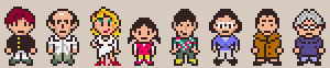
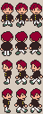
To get a good idea of that, let’s first bring out the mugshots of the cast from the original “Why Am I Dead”:

OldCast

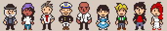
Brings back memories!  At the time, I was pretty happy with this work as a total beginner to pixel art.  And now the full cast for “Why Am I Dead 2”, in all its glory:

Cast

Okay, well, with just a quick glance they do seem rather similar.  After all, I haven’t changed the basic style or resolution of the sprites.  HOWEVER!  I think that even without taking the (much smoother) animations into account, the extra time that I’ve put into these new sprites can be seen when looked at closer.  There is less wasted space in the new sprites, and far less jagged outlines and edges.  Everything about the new characters is more varied — the posture, the frames, the hair, even the structures of their heads.  I’ve also become more sparing of outlines, which helps me free up space, and ultimately add more details.

To give an idea of the progression I, as well as these characters went through, I’ve dug up the older versions of some of the sprites and put them side by side.

First up is Alton, the blonde guy.  As the first character I worked on, he went through the wildest progression.

AltonProgression
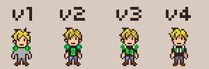
version 1 : OH GOD MY EYES!  Everything about this was terrible, though admittedly it was just to get the idea down.  The hair is too noisy, the arms are nonsensical and hunched over, and the legs are short and stubby.

version 2: Thankfully I changed the arms and legs to look, well, human.  I also simplified the hair, and added color.  His headphones still looked nothing like headphones, as I was struggling with how to depict them.  I was trying, and failing, to draw them as if they were poking straight out at the viewer.

version 3: Subtle changes here.  I tried another kind of headphones, and it also was not working.  I also changed the logo on his shirt from one meaningless shape to another meaningless shape.

version 4: I simplified.  A lot.  Took the t-shirt logo out, and used the new space to draw the headphones as if they were lying flat on his chest.  Toned down the shading on his hair, took out the shading on his pants, and changed the shape of his feet so they weren’t webbed-looking.

XuProgression
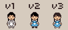
version 1: Hadn’t decided on colors yet, and was struggling with all of the information I was trying to get in.  Rolled up sleeves, collar, undershirt, skirt design — the heavy outlines just looked really busy.

version 2: I changed how the sleeves looked, and added color in a way to make things less busy.  Some details kept their hard outlines, while others lost them.

version 3: Changed the color and shape of her hair, which was cone-like and weird before.  Removed some more outlines, and went back to white shoes.

MarcurioProgression
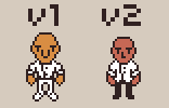
version 1: Yuck!  I was trying to experiment with different face-types, and knew that I wanted to give him a distinctive nose.  I wasn’t able to use my limited space to do both without making him freakishly huge.

version 2: Downsized his head, arms, and legs.  Also played with the shirt and sleeves to change his posture and make him look less macho and stiff.

DonovanProgression
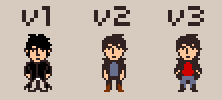
version 1: I had NO idea what I was doing with this guy at first, and was just throwing stuff at the wall.  His hair, face, and clothes are all a mess, and I did this stupid thing where I outline a black shape with a different black.

version 2: Simplified a whole lot.  The hair, arms, and legs all got smaller, and I alternated colors a bit so I didn’t have black on black with everything.  At the same time, I felt I strayed a little too much from my original concept and lost the effect I was trying to get with him.

version 3: A good compromise, I think.  Added detail rather than removed it, for a change!  The posture is more what I had in mind originally without looking stiff, and the different pieces of clothing are actually distinguishable from each other.

Once all of the art is done, I’ll be a hop skip and a jump away from a fully presentable demo.  The hope is to get there by the end of this month.  Time to break out the coffee!

A Very Short Summary of May

Well, May has come and gone, which is sadly to say that I missed the regular deadline for Indiecade.  In my young naive eyes however, hope springs eternal; the late entry deadline extends to the end of June, so I’m not out for the count.  Plans haven’t really changed, they’ve just gotten a bit…bumpy.

There is, I have to admit, still quite a lot of work left to be done, and I fell quite short of my optimistic estimates.    But the deadline did keep me honest, and I managed to accomplish a lot.  The character art is coming around the home stretch, the tilesets for mapping the game environment are done, I’ve cut into the writing, the AI pathfinding/movement has been smoothed out…and I’ve finished implementing another important aspect to the game that I haven’t really talked about yet.  It’s a bit hard to describe in short, but it was a major goal that I’m happy to have behind me.

There’s a lot more to say and quite a bit to show, but for now I’ll end by just laying out some tile art, which is used to generate the rooms in the game.  It’s not the flashiest kind of art asset to show off by itself, so I’m just dumping a lot of it at once to make up for that.  The image isn’t exhaustive, that is to say there are a couple tilesets not shown that will be in the game, but this is more than enough to get the idea across!

Tilesets

Some more art for WAID2

I feel I’m a bit overdue for an art update, so here’s a twofer; two new characters in one post!

I’m not sure I want to go into great detail about each character whose art I finish, since I think a big part of the game will be figuring out about them as you play.  And a lot of times they won’t be at all what they first seem, so it’s a bit hard to come up with non-spoiler descriptions.

First up is Xu:

Second is Marcurio:

I’ve already tried to mix up the pace/mood of the characters’ walk-cycles, so hopefully the animations are still clear.  It definitely makes things more interesting, and I generally walk away from each character having learned something new about animating.

Also, here’s the typical spritesheets for both games, old and new, side by side.

Cricket     RevisedAltonanim

The afterlife gets a facelift!

Today I’d like to show the art behind one of the characters in Why Am I Dead 2, and use it as a bit of an example for what can be expected in the sequel’s art.

Meet one of ten major characters in the game, Alton.

RevisedAlton

As you can see, I’m sticking with the Earthbound-esque style of the previous game, which means bright colors, strong outlines, and simple shapes.  However, I will be putting much more attention to detail in each sprite, making presentation better all around.  This particular sprite above is the result of many iterations, and a lot of time spent learning more about pixel art.  I’m generally not so concerned about visuals, but I really want to cram as much personality into each sprite, since the game is so character-centric.

But the part I take most pride in is the considerable improvements that all animations will have.  In the first game, every walk animation had four frames, but with the huge caveat that two of them were just the regular idle frame.  Doing that saved a lot of time, but it’s poor form and looks really shoddy.  To demonstrate, let’s revisit the character Cricket from the first Why Am I Dead.

CricketFrontx2CricketLeftx2CricketBackx2
CricketRightx2

These animations served their purpose at the time, but would be a huge limitation going forward.  You can probably notice that the legs come together and apart in an unrealistic way, which is the cost of recycling frames — and overall it’s a bit choppy.  All of the new animations, however, will use six frames rather than four, and all of them will be unique, and they will have full-body animations, not just moving hands and feet.

AltonFrontx2AltonLeftx2AltonBackx2AltonRightx2

(There will also be some bonus animations that I shall not be posting yet, but which will be in game!)

The one thing that the previous game did have going for it was that all of the animations were done ground-up for each character; I never used character templates to speed things up, which means that every character had a different walk, as choppy as it was.  Quite a few people pointed this out, as it gave each character a different feel, and brought out their personality more — some ran, some hobbled, some sauntered.  Well, that is a practice that I fully plan to continue for the sequel, as time-consuming as it is.  So, expect to see more characters in the future, each with their own strut!

A Hopefully Intriguing Prototype

First off real quick, after work with a graphic designer I know, I have a new logo which you’ll see emblazoned at the top of this blog.  I’m quite happy with the result!  With this new logo in hand, I redesigned my home website once again.  The results, before and after:

The result is a brighter design with way more space, and a quite sexy logo if I do say so myself!  I also used a bit of JQuery in this version of the site, which was nice to dabble in.

The main thing I’d like to talk about in this post, though, is that I put up a game prototype on my website.  I’ve been working on it for about a month and a half alongside preparing Why Am I Dead for its release into the wild.

You can find it here!

Of course the big issue with it is that there’s no tutorial, so it may take some patience to actually understand what’s going on.  I wrote at length about the rules and how they work in that page, so I’ll not do the same thing here.  Instead, I’ll talk more about the technical side of things, and why this prototype took over a month to make.  Sure, it doesn’t have immediate visual appeal, but that’s not what prototypes are about.  And frankly, I did some stuff that I’m quite satisfied with.

1: Menus in menus in menus in menus

The game is turn-based, and, as with most turn-based games, it centers around picking from a range of different options which are on a menu.  Some actions may have further options related to those options, which require some other menu.  Think about typical RPGs.  You can attack, defend, cast a spell, and use an item.  But if you select Spell, what spell do you pick?  And then, who or what is the target of that spell?

In my case, the details get way, way more complicated.  For instance, the actions you can choose from are often restrained by temporary effects.  Get hit in the legs, and now you can’t pick Move or Dash.  Even more, you can select two actions per turn and sometimes these effects will go away in between those two actions, thus freeing up new actions mid-turn.  So, the result is that there will be menus in menus in menus, appearing and disappearing, switching around and changing all the time.

One of my main priorities was to make this as easy and intuitive to program as possible, so that when game mechanics inevitably get changed as the game is refined, actually implementing those changes is painless and straightforward.  To that end, I think I’ve succeeded; just about any change in the player menu, no matter how big or small, can be accomplished in several lines of code on the client-side.

Good thing none of this is confusing!

2: Customization!

After I got the basic game mechanics in, I decided to implement something I’d only been toying with beforehand; full equipment customization!  That is to say, every piece of equipment or weaponry would be represented on screen in battle, and move alongside your character when he attacks and defends, and so on.

The thing that made this a bit more ambitious for me is that I don’t use Flash Professional, or really any tools that might make this easier; I am working in FlashDevelop 100% of the time.  Still, it was pretty straight-forward for the most part, if more time-consuming.  One of the most vexing issues, to be honest, was making sure that the equipment had the correct rotation and positioning when I flipped the bitmap for the opponent.

And again, I’m pretty satisfied with the results.  The work behind making new equipment, as well as swapping between pieces of equipment, are trivial.  And though the prototype doesn’t have flashy animations, the poses behind each action are convincing enough to make this effect, at least to me, visually impressive.

Yes, it’s kinda choppy. Yes, vectors would rotate better. But bitmaps have more charm!

So that’s about it.  I’d love any feedback on my li’l prototype, since it’s still in an early and flexible stage.  I’ll actually be taking a break on this project in order to handle some real-life stuff and other things I’ve been juggling around, but I definitely like the direction this is going in, and fully plan to return to it in the future.  With a tutorial, an equipment screen and some kind of metagame, I think this could be a really deep and fun game.

My first game launch, as it were

I got off extremely lucky compared to many other North-easterners regarding Hurricane Sandy.  In my area there were power outages and the occasional tree falling on some poor sod’s car, but no floodings or fires or what have you.  I wasn’t even one of the people who lost power, I just lost internet for several days, and I’m pretty grateful of that.

And not long after my internet returned, my first game is now online!

YOU CAN PLAY IT HERE

As my first game’s launch, this is kinda how I feel right now:

yeah

The image is taken from this article written by Derek Yu, which mirrors my thoughts and feelings on finishing a game in a myriad of ways.  I mean, I had kinda already finished Why Am I Dead a long long time ago, but only sort of finished it.  This time, I finished finished it.  And it feels good.  Oh, here’s another image from the same article that seems appropriate:

feels good man

Anyway.  With all this excitement, it’s pretty much impossible for my standards of success not to be met.

“This game is too short!”  == My game left people wanting more.  Success!

“This game confused me.”  == My game got people thinking.  Success!

“This game was impossible to beat.”  == My game was ambitious.  Success!

“I absolutely hate this game and I want to injure you.”  ==  My game, uh…created an emotional response.  SUCCESS!

…On a more serious note, I’m looking forward to getting feedback and growing as a developer/designer from the responses I get.  And of course, other projects are in the works, one of which I’m very overdue on talking about!